The beginnings of the environmental justice movement can be traced back decades to concerns around waste sites, but transparent data about the issue has only become more common among major companies in recent years.
WM, Republic Services, and Waste Connections — the largest U.S. landfill operators — released the latest versions of their own sustainability and environmental justice documentation this year, varying in degrees of data transparency, analysis, and commitments.
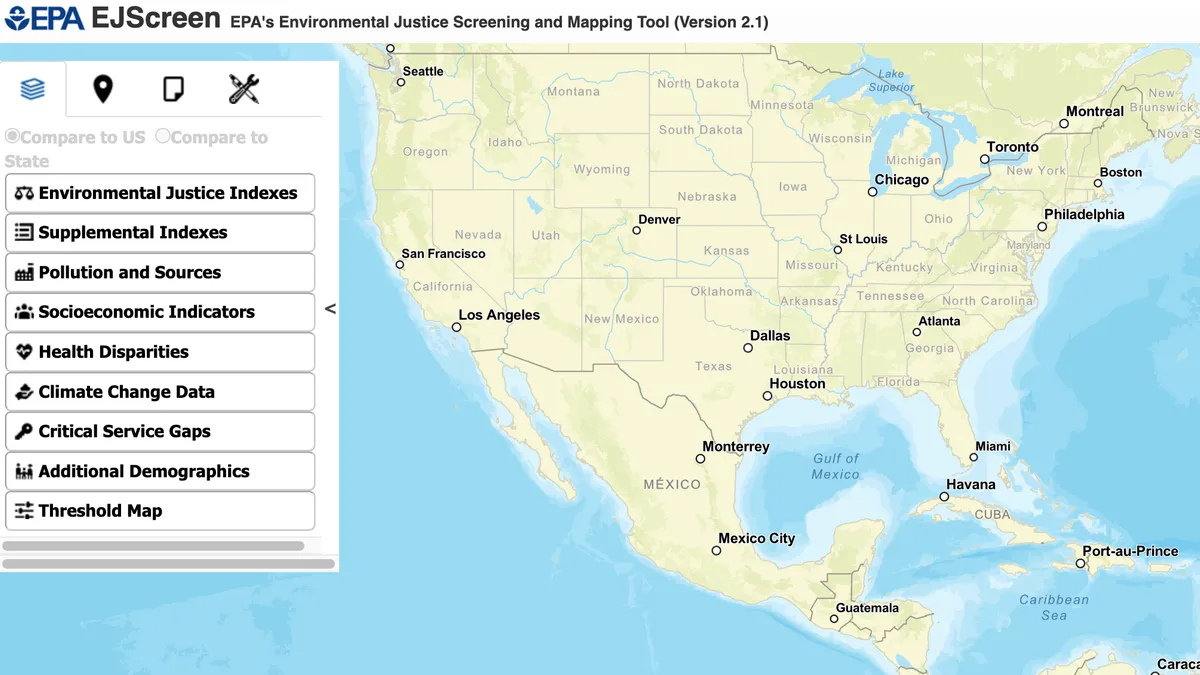
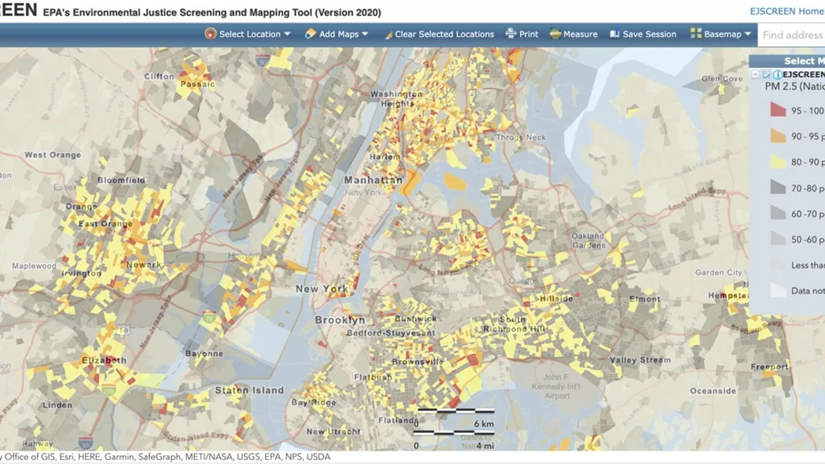
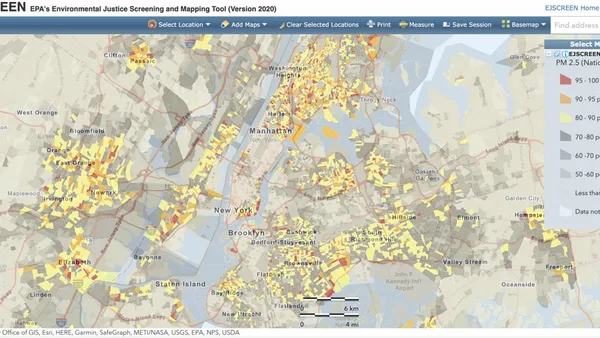
All three reports utilized the U.S. EPA’s EJScreen, an open-source environmental justice mapping and screening tool. The 12 environmental indicators, seven socioeconomic indicators, and 17 environmental justice indexes all incorporate publicly available data which the EPA then displays at the desired geographic scale. The resulting report presents these indicators and indexes at the selected geography, including specific points; in the case of these environmental justice reports, the company-specific sites.
The EPA itself notes a few limitations for the tool, including that it is a national tool, and therefore cannot capture all environmental concerns at that scale, even if certain indicators may be available on a state or county basis.
Since at least the early 2000s, the EPA has studied the health effects of living near certain landfill sites, such as the potential leaking of toxic chemicals like lead, arsenic, and mercury into the water, air, and soil. These chemicals can cause long-term physical health impacts, like cancer and birth defects. Increasingly extreme climate events may also lead to further contamination through heavy rainfall, flooding and winds.
Though there is no agreed-upon extent to which these effects can travel, academic research in Europe has found potential health risks for people who live within five to 10 kilometers of a landfill site. A recent academic review of dozens of studies on health effects from a variety of waste sites found some evidence of adverse health effects “associated with residing near landfills,” though also noted that “in many cases, the evidence was inadequate to establish a strong relationship between a specific exposure and outcomes.”
Digging into the data
WM, Republic and Waste Connections all used a radius of 1 km for the EJScreen tool in their final analysis. Republic also included a range of 5 km in its extended report, and WM noted that its original environmental justice impact study in 2010 used a 5 mile or 8 km radius.
WM’s justification for shrinking this distance is to provide a “more localized view of those most impacted” by its operations. WM provided its analysis broken down by facility type; landfills were surrounded by 44% minority communities and 13% low-income households, and hazardous waste facilities with 9% minority communities and 0% low-income households.
At the 1 km radius, Republic reported that “64% of our locations have a surrounding population comprised of fewer ethnic minorities than the state average and 36% of our locations are above the state average.” The company also said that “58% of our locations have fewer surrounding households below the poverty level than the state average and 42% of our locations are above the state average.” The percentages above the state average adjusted slightly after extending the radius to 5 km. Both the 1 km and 5 km analyses had much lower percentages for minority or poverty-level households near landfills compared to other facilities.
Waste Connections published its results in its larger sustainability report with a 1 km radius, which noted that 13% of the communities surrounding its facilities were considered “at risk” areas, 12% were minority communities, and 21% were low-income communities. The company’s separate document on environmental justice does not include information from larger radii.
Constraining data analyses to just physical facility locations can also skew actual environmental justice impacts, explained Byron Chan, a senior associate attorney at Earthjustice.
“You're talking about the trucks that are coming into the facilities — where they're coming from, where they're not going to, will not just be a mile outside of the facility,” Chan said. “So even [WM’s] original radius itself was really insufficient at understanding what all the impacts that the facility is having on communities surrounding the facility itself.” WM is the only one of the three that disaggregates its data based on facilities, and includes hauling as one of the categories analyzed.
David Konisky, a professor at Indiana University’s School of Public and Environmental Affairs, recently published a study analyzing both EJScreen and 18 other state-level environmental justice tools. Through this research, Konisky became familiar with the different radii used across analyses.
“In the scholarly literature, people tend to use different radii like one kilometer or sometimes three, sometimes five. Some use miles instead,” he said. “[It’s] not as if there's a single approach ... what would be more informative is if they did multiple approaches and actually see what the differences are.”
Local applications
One example of a site analyzed by WM is the Kettleman Hills Facility in California, a hazardous waste treatment and disposal site. The facility is only four miles away from Kettleman City, which has a population of roughly 1,200. Local organizations such as El Pueblo have raised environmental justice concerns about the region for decades.
Monica Wilson, associate director at the Global Alliance for Incinerator Alternatives, commented on her own interpretation of the WM environmental justice tool by looking at Kettleman Hills specifically. She noted the WM data states that nobody lives near the facility for the 1 km and 5 km radii, but when expanded to 10 km, the surrounding community is 94% people of color.
WM’s overall summary states that the population surrounding hazardous waste facilities in the defined 1 km radius is made up of only 11 people, and further data on the 5 km and 10 km radii can be found after expanding the initial dataset.
Thomas Helme, coordinator of the California Environmental Justice Coalition and co-founder of Valley Improvement Projects, expressed similar concerns about the Kettleman facility data. In his view, there are inconsistencies from localizing the data by shrinking the radius for WM.
“Localized means you’re cutting out the closest community to it,” said Helme, “but WM did promise to provide clean water to Kettleman City, which says they have some knowledge there was wrongdoing if they’re making an attempt to rectify it.”
In 2013, a local news station reported that if WM’s landfill expansion permit was approved, the company would help cover the debt on the town’s water system. The company recently confirmed that the expansion was approved in 2014.
“As part of the permitting process and pursuant to the Tanner Act, the Kettleman Hills Facility paid the Kettleman City Community Services District’s water debts in the amount of $522,300 so they could move forward and apply for grants for a new water treatment plant,” said Janette Micelli, WM’s director of external affairs, via email.
WM also provided further context on the radius change.
“In 2021, we changed our approach to reflect feedback from investors and environmental justice experts, including changing the radius of households surrounding our facilities from 5 miles, as reported from 2010-2020, to 1 kilometer. This provides a more localized view of those most impacted by WM operations in the neighborhoods surrounding our facilities,” wrote Micelli.
Helme believes there are still tremendous benefits of using a tool like EJScreen in the context of waste and pollution, even if the impact can potentially be skewed depending on radius constraint.
“We’re putting together not just pollution burdens, but the socioeconomic burdens,” he said. “You may live in a wealthy area with pollution, but there’s more homeowners and landowners who tend to have more influence on the local government ... their concerns are listened to a little more and they have a larger network and more connections to those in power.”
Helme and Chan have both used CalEnviroScreen in their own analysis and arguments as an alternative to EJScreen that is more specific to the state. Helme found that CalEnviroScreen had its own constraints, where the data is limited to census tracts. EJScreen data is primarily available at the smaller, block group level. These parameters can sometimes skew results in large rural areas where smaller communities may see effects, but wide census tracts may dilute that data.
Konisky thought the analysis and transparency of data were unique, especially in the industry, and expressed optimism about the evolving reporting efforts.
“It is very self reflective and ... informative in some important ways about their own footprint, who may be affected by their facilities, who live in close proximity,” he said. “So on one level, the very fact that they're producing this report is quite notable and probably not very common, either in their sector or more broadly.”
Chan was more cautiously optimistic. He explained that though these reports are considered a step in the right direction, there was still more depth needed.
“It’s a recognition that environmental justice and environmental consciousness matter ... But at the same time, these issues have surrounded facilities for decades,” he said. “The report was not talking about any commitment to address anything… there’s no action items or there's no comments. There's no pledge, there's no acknowledgment of harm.”
In another sign of the evolving discussion, this area has also been the focus of recent shareholder advocacy. Last May, WM shareholders approved a proposal to conduct a civil rights audit and update environmental justice data. While Republic shareholders voted down a similar proposal, the company has since voluntarily agreed to conduct its own audit.


